I wanted to take on a project that felt familiar but had room for growth because I was new to UX design. I started by researching possible case studies and coming up with suggestions using ChatGPT. I decided to examine and enhance the Gmail mobile app after doing some research on Google-related mobile apps. I use this application on a regular basis, and even though it’s widely used, I saw certain places where it might be easier to use and more intuitive. My first major step into the field of UX design was this project. Here are my methods, the things I discovered, and the reasons why the journey was so rewarding.
Starting with Research
Finding areas that required improvement was the first step. After considering my own experiences with the Gmail app, I looked more closely at user reviews. In order to identify pain points that were mentioned by regular users, I looked through random customer reviews on the Google Play Store.
To broad my understanding, I shortlisted the most relevant and highly upvoted reviews (1.5k+ upvotes in total) from June 2024 to September 2024. Through this process, I categorized six key issues that users faced while using the Gmail mobile app, they are:
- Difficult to switching between multiple email accounts and cannot identify which account using in Gmail app
- Little or no control when customizing the interface
- Hard and poor control have when used search filter function
- No control over label handling management like in the web version
- Limited options in handling email actions in the notification bar
- Little or no usage in google meet in bottom navigation bar
Upon identifying these pain points, I proceeded to further validate them. I made a Google survey with four to five questions for every category and sent it to 20 active users who were using the Gmail mobile app.
The answers were helpful and related to the problems I had noted. Users expressed annoyance with confusing interfaces, the inability to transition between accounts, and the absence of user-friendly features. This problem validation provided me with a clear improvement plan that includes improving accessibility, simplifying navigation, and clearing out the interface.
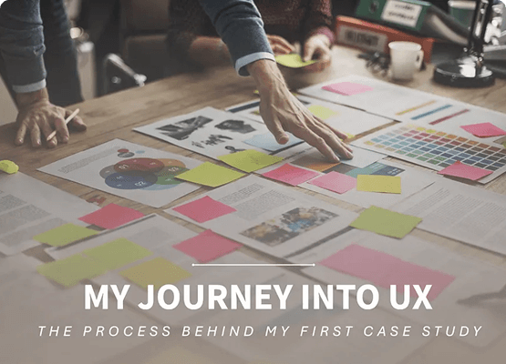
Sketching and creating final high-fidelity wireframes
After obtaining validated problems, I proceeded to generate ideas for potential solutions. I started with initial Figma sketches, concentrating on concepts that might address and resolve user problem issues. Solution for identify pain point are,
- Gives more reliable way to navigate between user account and identifying user accounts
- Give more user control to handle the labels in side navigation bar
- Empower the search experience from robust search filter
- Enhance and increase the control over label handling management like in the web version
- Expand the opportunity of handling email actions in the notification bar
- Provide user friendly approach to google meet icon in bottom navigation bar
Despite their flaws, these sketches were an excellent place to start when trying to visualize my ideas. After I was comfortable, I used Figma to create high-fidelity wireframes.
During the process, I made sure the designs aligned to Gmail’s established design language while placing a high priority on usability and simplicity.
Challenges and Lessons Learned
Maintaining compatibility with Gmail’s current appearance while making enhancements was one of the biggest obstacles. Millions of users are accustomed to the app’s layout, so significant modifications could interfere with their experience. It was crucial to find the ideal mix between novelty and familiarity.
Working alone on such a large project gave another difficulty. I was able to maintain my motivation and focus by breaking the work up into smaller, more achievable tasks.
Advice for Beginners
I have one piece of advice for folks who are new to UX design: choose a project that interests you. Decide on an area you are enthusiastic about and concentrate on helping users with their actual difficulties. Never hesitate to modify your designs or seek input.
I learned from this case study that UX design is a creative and experimental process. Creating meaningful, useful experiences is more important than simply making things look nice.
Final Thoughts
The experience of starting this adventure has been rewarding. In addition to expanding my knowledge of UX design, it also offered me the self-assurance to take on more ambitious projects in the future.
Thank you for reading!
Link to case study:
Case Study: Enhancing Google Gmail Mobile App Usability